What is the best font for a resume? Which fonts to avoid? Serif or sans serif? And font size? What about bolding and italicizing? And those pesky section heading titles?
So many questions surround such a seemingly everyday task as choosing a font. Okay, you can stop staring at your screen. With this quick read, you’ll choose the perfect font for your resume.
This font guide will show you:
- The best resume fonts to choose and fonts to avoid.
- What size font for a resume and a cover letter works like a charm on employers.
- Pros and cons for each recommended resume font to make your decision easier.
- Tips and tricks for standard professional fonts to use on a resume.
Want to save time and have your resume ready in 5 minutes? Try our resume builder. It’s fast and easy to use. Plus, you’ll get ready-made content to add with one click. See 20+ resume templates and create your resume here.
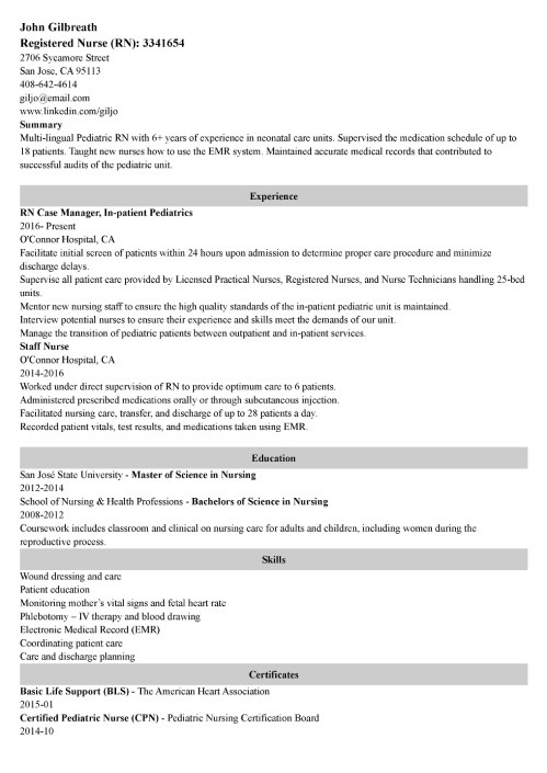
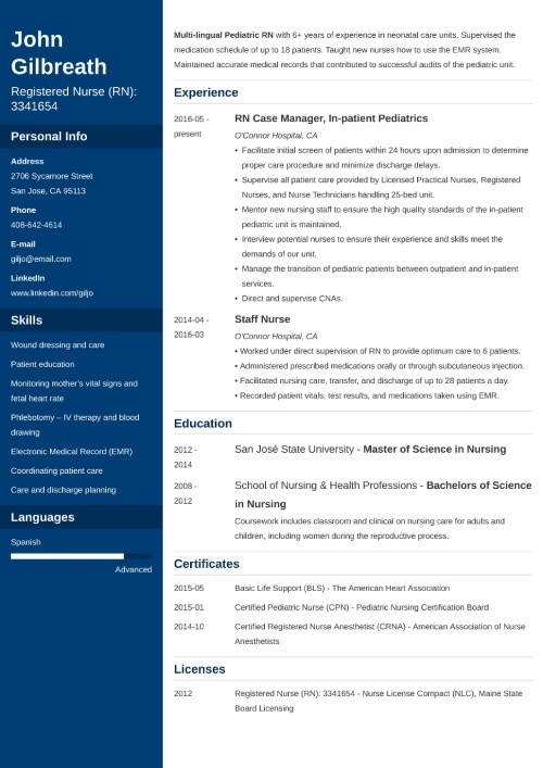
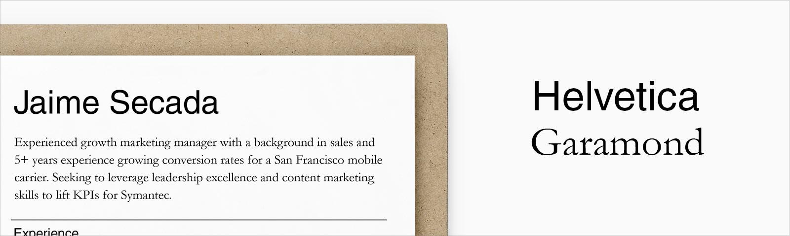
Sample resume made with our builder—See more resume examples here.
1
What Font to Use for a Resume
Recruiters and hiring managers take 7 seconds to initially scan your resume, according to our HR statistics report. That’s just about how long it takes the average person to read these two sentences. The font you pick has to be legible. Here are our recommendations:
Resume Font Size
The standard font size for resumes is 12 points in a classic and easily readable font. Larger fonts are good for emphasizing your name and section headings. If you can't fit your content on one page you could try using a sans-serif font at 10 points, but that's the minimum font size you should use.
Common Resume Fonts
- The most common font used is black Times New Roman at 12 points in size.
- Other serif fonts, those that have tails, that work well include Cambria, Georgia, Garamond, Book Antiqua, and Didot.
- Sans serif fonts, those without tails, that work well include Calibri, Helvetica, Verdana, Trebuchet MS and Lato.
- Use bolding, italicising and CAPITALIZING to emphasize important information such as your name and section headings, but be consistent.
Now let's take a look at each of our recommended resume fonts in more detail.
Best Font for Resume in 2023:
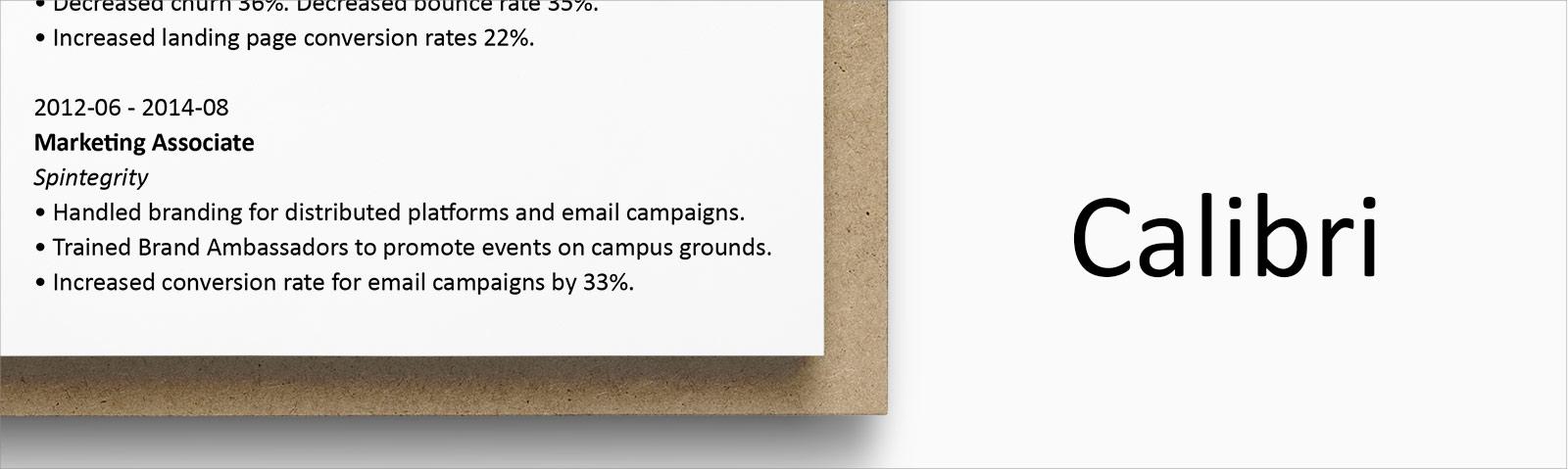
1. Calibri
Category | Designer | Date Created |
Sans-serif | Lucas de Groot | 2002–2004 |
Lucas de Groot, a Dutch type designer, was commissioned by Microsoft to create Calibri to replace good old Times New Roman as the default font for Office. It’s a contemporary font that simply tries to maximize relatability, skipping dated serifs but without the intense flourish of other modern fonts—perfect for today’s resumes.
Pros: As a default font, Calibri will usually render correctly when a hiring manager opens your resume. It’s a professional and easy-to-read font, and it won the TDC2 2005 Type System award from the Type Directors Club.
Cons: As a default font, it also means other job seekers may use Calibri, which means your resume might not stand out from others.
Alternative: Carlito is a font created by Google that is a match for Calibri, metrically compatible, and intended as an open-source substitute.
2. Cambria

Category | Designer | Date Created |
Serif | Jelle Bosma | 2004 |
Like Calibri, Cambria was also commissioned by Microsoft by a Dutchman and created in 2004. With its serifs (those little lines at the end of each stroke in a letter; we’ll get to them soon), Microsoft states that it was “designed for on-screen reading and to look good when printed at small sizes.” And that makes it a great font for the content of your resume and cover letter.
Pros: Cambria makes it easy for readers to quickly decipher smaller text sizes.
Cons: It is often described as “traditional,” which may make it less suitable for more modern jobs.
Alternative: Caladea is a font created by Google that is a match for Calibri, metrically compatible, and intended as an open-source substitute. However, it seems now that Google Docs includes Cambria to choose from, as well.
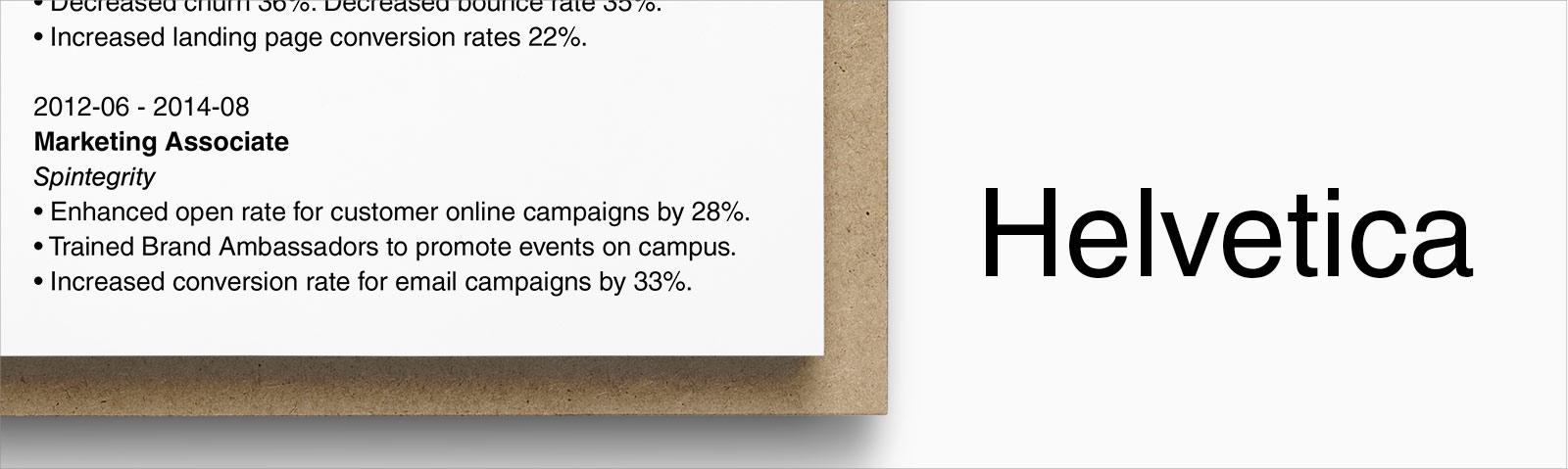
3. Helvetica
Category | Designer | Date Created |
Sans-serif | Max Miedinger | 1957 |
A Swiss designer created Helvetica, a neo-grotesque typeface; Originally named Neue Haas Grotesk, it was soon licensed by Linotype and renamed to resemble the Latin word for Switzerland, “Helvetia.” It’s a font that remains popular in the advertising industry as a gorgeous, easy-to-read sans-serif font. Both the New York City subway system and major corporations like BMW use Helvetica for their signs.
Pros: A lot of professionals rank Helvetica as one of the more beautiful sans-serif fonts. A perfect font to use on a CV!
Cons: Helvetica comes preloaded on Macs, but you aren’t going to find it listed under fonts in Microsoft Word. You’re going to have to buy it if you want to use it and don’t have a Mac.
Alternatives: Arial is the default font for Google Docs and also a standard font for Microsoft Word, which means it will display correctly cross-platform and on most computers. To most non-specialists, it is difficult to distinguish the differences. Roboto is another, less-similar resume font alternative created by Google and available for open use.
Pro Tip: Even if you save your resume as a .pdf file, the font can go screwy in transit. To make sure your typeface stays intact, embed the font in the file. When saving (or “printing”) as .pdf in Microsoft Word, go to Options > Save and check the item that reads “Embed fonts in the file” or similar.
4. Georgia
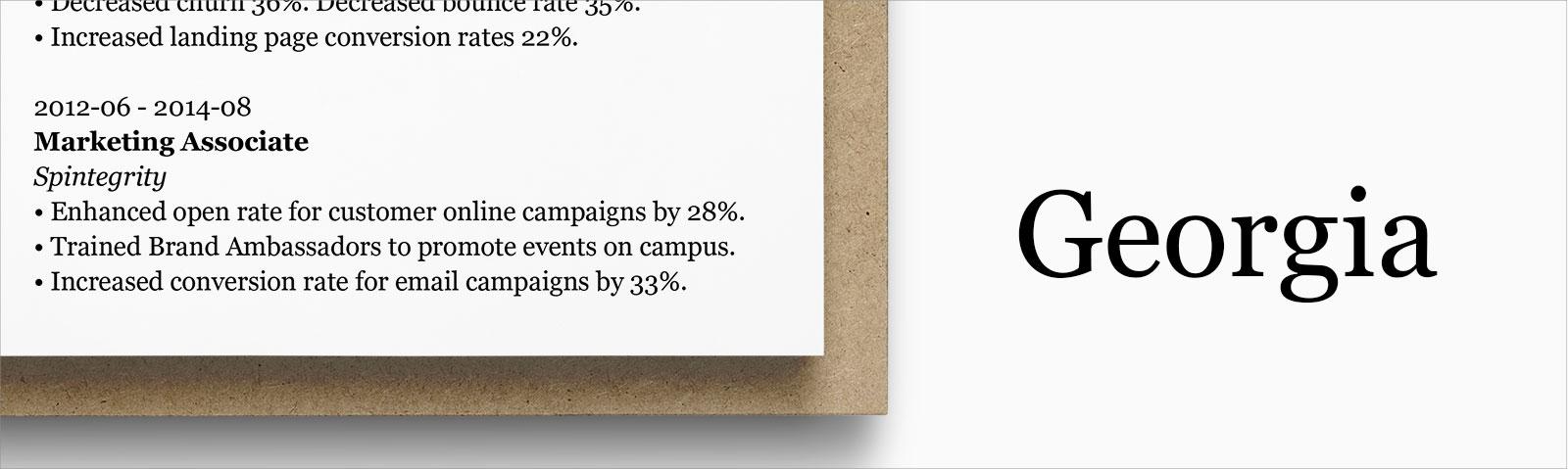
Category | Designer | Date Created |
Serif | Matthew Carter | 1993 |
Designed for Microsoft in the early 90s, Georgia is still one of the most popular fonts used today; it’s used by the New York Times online and by many big corporations, such as Yahoo, Amazon, and Twitter. Georgia is a font that’s easy to read online, making it ideal if you plan to send your resume as a PDF.
Pros: You can find Georgia across writing platforms. It’s accessible and a fine replacement font for other serif typefaces, like Times New Roman. Recently (2013) re-released and updated, so it’s up to date.
Cons: Georgia’s popularity may make it hard for you to stand out. Also, it was inspired by Scotch Roman designs of the 19th century, so if you want to stand out, you might want to go with something else.
Alternative: Times New Roman remains one of the most-used resume fonts, even today. People love to hate it because it’s not a creative font, but it’s still a safe (if boring) choice for most job seekers.
5. Verdana
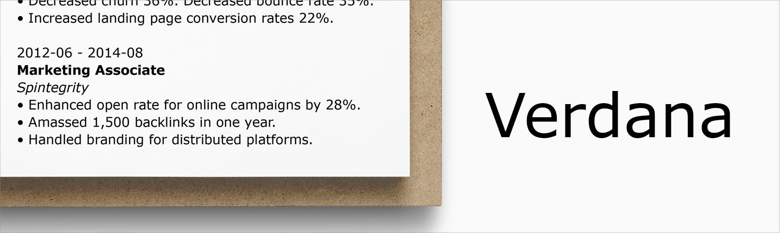
Category | Designer | Date Created |
Sans-serif | Matthew Carter | 1996 |
Matthew Carter created Verdana for Microsoft as the sans-serif sister to Georgia. He designed the font so that it is easy to read in small print on computer screens. Verdana remains one of the best professional fonts for resumes, CVs, and cover letters alike.
Pros: Great for job seekers who need to squeeze more onto their resumes, as it was optimized for small-print legibility.
Cons: If you’re seeking a “wow” CV font, keep on looking. Verdana doesn’t look all that different from Arial and Arial looks like Helvetica.
Alternative: The Futura font is a common replacement for Verdana; however, in 2010, Ikea switched from using Futura to using Verdana. They paid millions to their marketing team to come up with that suggestion, so make of that what you will.
6. Garamond
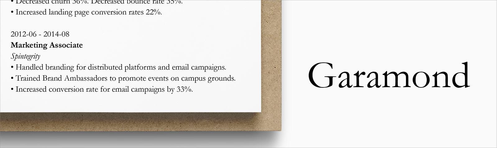
Category | Designer | Date Created |
Serif | Claude Garamond | 1400s (!) |
Garamond is a family of fonts with a long history, coming from 15th and 16th-century designs. Many describe Garamond as timeless. Jean Jannon later designed a similar typeface that most other digital versions of Garamond resemble. Monotype’s version, dated 1922, is bundled with Microsoft products and remains the most popular of this typography family.
Pros: Among designers and ad managers, Garamond is a favorite. It meets all the requirements of a good resume font: easy to read, attractive, classy, and not something everyone and their mother uses.
Cons: Some might say that Garamond’s timelessness is just a more optimistic way of saying that it’s old; it is from the 1400s, remember?
Alternative: Cormorant is inspired by Garamond’s design, but it is openly available and Google Fonts financed the development to enable its libre release.
7. Trebuchet MS
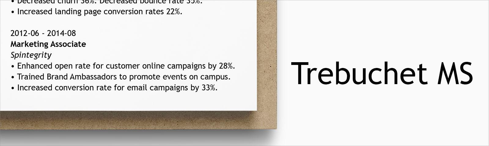
Category | Designer | Date Created |
Sans-serif | Vincent Connare | 1996 |
A trebuchet is a medieval siege engine that launches projectiles of slow, painful death (such as buckets of stones or dead bodies to spread disease) long distances and over defending walls. Vincent Connare "thought that would be a great name for a font that launches words across the Internet". Connare knows his fonts—he is behind the world-renowned (but not resume-friendly) Comic Sans font, as well.
Pros: Microsoft released Trebuchet as one of their core fonts for the web. You can find it easily even on competitors such as Google Docs.
Cons: If you want to utilize some additional features for the Trebuchet MS font, such as small caps or text figures, you’ll have to pay for the commercial version, Trebuchet Pro.
Alternative: Fira Sans is a decent alternative to Trebuchet, and it is openly available on Google Fonts. Also, Source Sans Pro is freely available for commercial use.
8. Lato
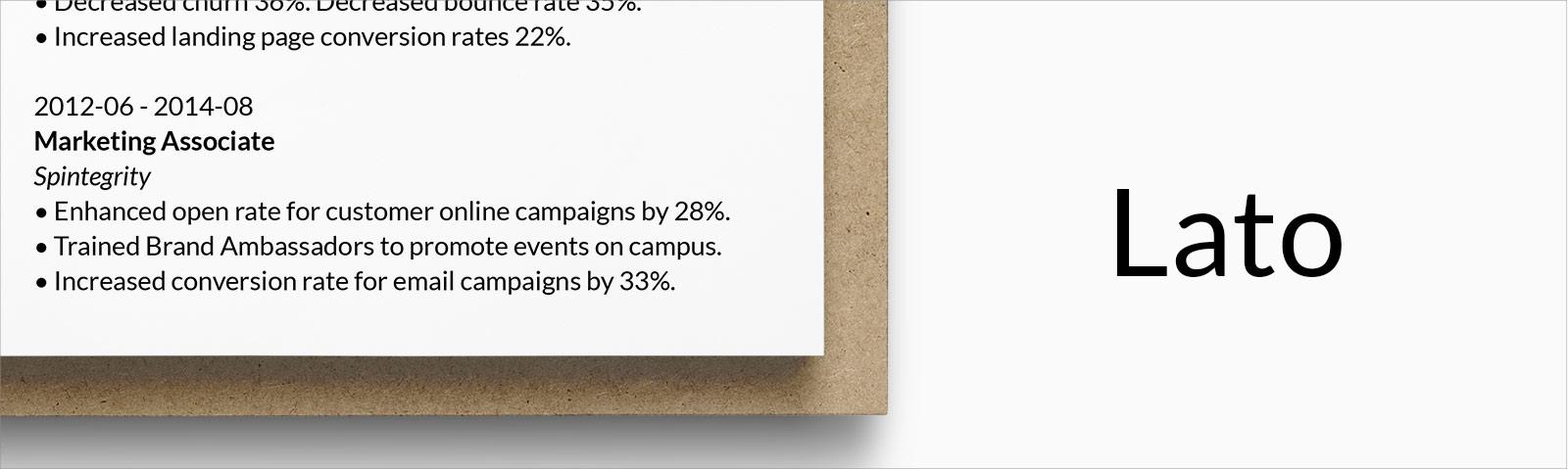
Category | Designer | Date Created |
Sans-serif | Łukasz Dziedzic | 2010 |
Łukasz Dziedzic, a Polish typeface designer, designed the Lato font for a large corporate client, which is why he wanted this typeface to have both serious and friendly qualities. That dual nature gave it the “feeling of the summer,” so he named the font after the Polish word for summer.
Pros: As an open source font (SIL Open Font License), you can download and use it for free. Lato is also a corporate font, so you can rest assured that it’ll work well on your resume. It can be found in the Google Font library openly.
Cons: Lato is not a standard Microsoft Word font. That might mean that it will not load when some hiring managers open your resume.
Alternative: Open Sans is a great replacement for Lato, being one of the most popular professional fonts on the web today, openly available, and able to be used commercially.
9. Book Antiqua
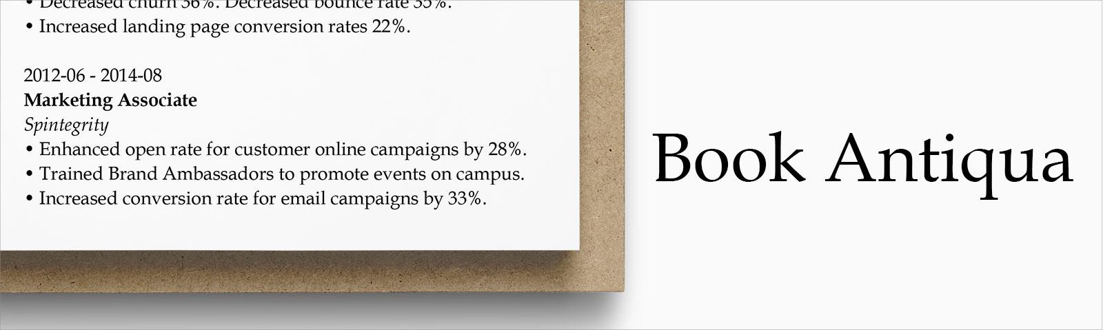
Category | Designer | Date Created |
Serif | Hermann Zapf | 1954/1993 |
If you imagine modern resume templates ought to prefer typography named Web Nova or Selfie Futura instead of this, you’d be wrong. Book Antiqua is a Microsoft clone of the industry-fave Palatino font, and it is one of the best serif fonts to use for resumes.
Pros: As a Microsoft version of Palatino, it is readily available on most operating systems and office programs.
Cons: Palatino is based on humanist styles of the Italian Renaissance, so it may make your resume feel, well, antiqua.
Alternative: Iowan Old Style is similar, stylistically, but with its higher x-height, it is more easily read on screens and small displays. Also, Apple licensed it, so it is available by default on Macs and Pages.
10. Didot
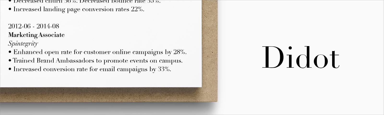
Category | Designer | Date Created |
Serif | Didot Family | 1784–1811 |
Didot is an elegant font designed by Firmin Didot just before the French Revolution. While not as old and classic as Garamond, it was born during the Enlightenment and the reign of Marie Antoinette, so it’s a good font for dressing up your resume.
Pros: Many professionals associate the font with fashion; Ralph Lauren and Marks & Spencer use Didot on their websites. Its elegance qualifies as a safe choice if you must go with something fancy.
Cons: You must purchase Didot if you want to use it on your resume. Too much Didot on a page takes it from tastefully elegant to endangering your resume from suffering the same fate as Madame Déficit.
Alternative: Bodoni is a font family with numerous variations. You’ll have more to sort through, but many are also available freely to the public.
When making a resume in our builder, drag & drop bullet points, skills, and auto-fill the boring stuff. Spell check? Check. Start building a professional resume template here for free.

When you’re done, Zety’s resume builder will score your resume and tell you exactly how to make it better.
2
Alternative Fonts
The above are our list of best resume fonts, but what if you’re using an online builder, like ours, which isn’t allowed to distribute many of those fonts commercially? Or what if you want a less-common alternative?
My suggestion for an alternative font is to use Google’s very own Noto font family. Noto stands for “NO more TOfu,” tofu being the term for the boxes that replace letters or symbols that a system can’t render.
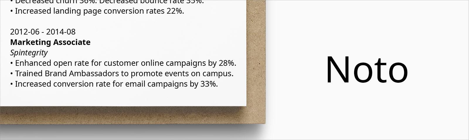
According to Google, “Noto provides pan-language harmony, yet maintains authenticity. The goal is great online readability across languages without losing the character that makes each script special.”
Noto fonts, available in both serif and sans-serif versions, cover a whopping 93 different language scripts (alphabets), almost 600 languages, and over 230 geographical regions on earth. It truly is a world-uniting font, perfect for today’s globalized industries, and one I highly recommend.
3
Serif vs. Sans-Serif

What is a serif font?
Serifs refer to the little lines at the end of each stroke in a letter; these fonts are referred to as a serif, or serifed, typeface. They originated way back in Roman antiquity, and they may feel dated compared with similar sans-serif counterparts.
What are sans-serif fonts?
Sans-serif fonts are those that do not have the lines at the end of each stroke; because of that, designers often describe them as fresh, modern, and good for resumes.
Serif or sans-serif fonts for my resume?
Serif fonts are said to be slightly easier to read, as those little brushstrokes on each letter help your hiring manager’s brain to compute what they’re reading just a little bit faster. However, sans-serif fonts are prized on modern resumes for their contemporary look and seamless integration with today’s resume designs.
4
What About Italics and Bold?
Bold text is great for drawing particular attention to a few words. Though you may have already increased the font size for titles, bolding can help subtitles stand out without having to enlarge them.
Italics are useful for supporting text, just like the smaller font size we mentioned before. Use them in places like the city and state related to a university of a degree listing, for example.
Avoid underlining words or phrases in a resume or cover letter, as it just adds too much formatting and makes the document feel cluttered.
6
Pairing Fonts
One common trick that many visually-inclined resume makers use is to pair two fonts on a resume. The best font pairs agree with each other, work together in harmony, and don’t fight the reader for attention.
Many job seekers who pair fonts choose two contrasting typefaces, perhaps a standard script with a cursive script, or sans-serif with serif. Then, they would use one for the main content, and the other for larger elements, such as their name and section titles.
Make sure the font on your resume is consistent with your cover letter font, too!
Plus, a great cover letter that matches your resume will give you an advantage over other candidates. You can write it in our cover letter builder here. Here's what it may look like:
See more cover letter templates and start writing.
Key Takeaway
So, what’d you think? Not so hard, after all, was it?
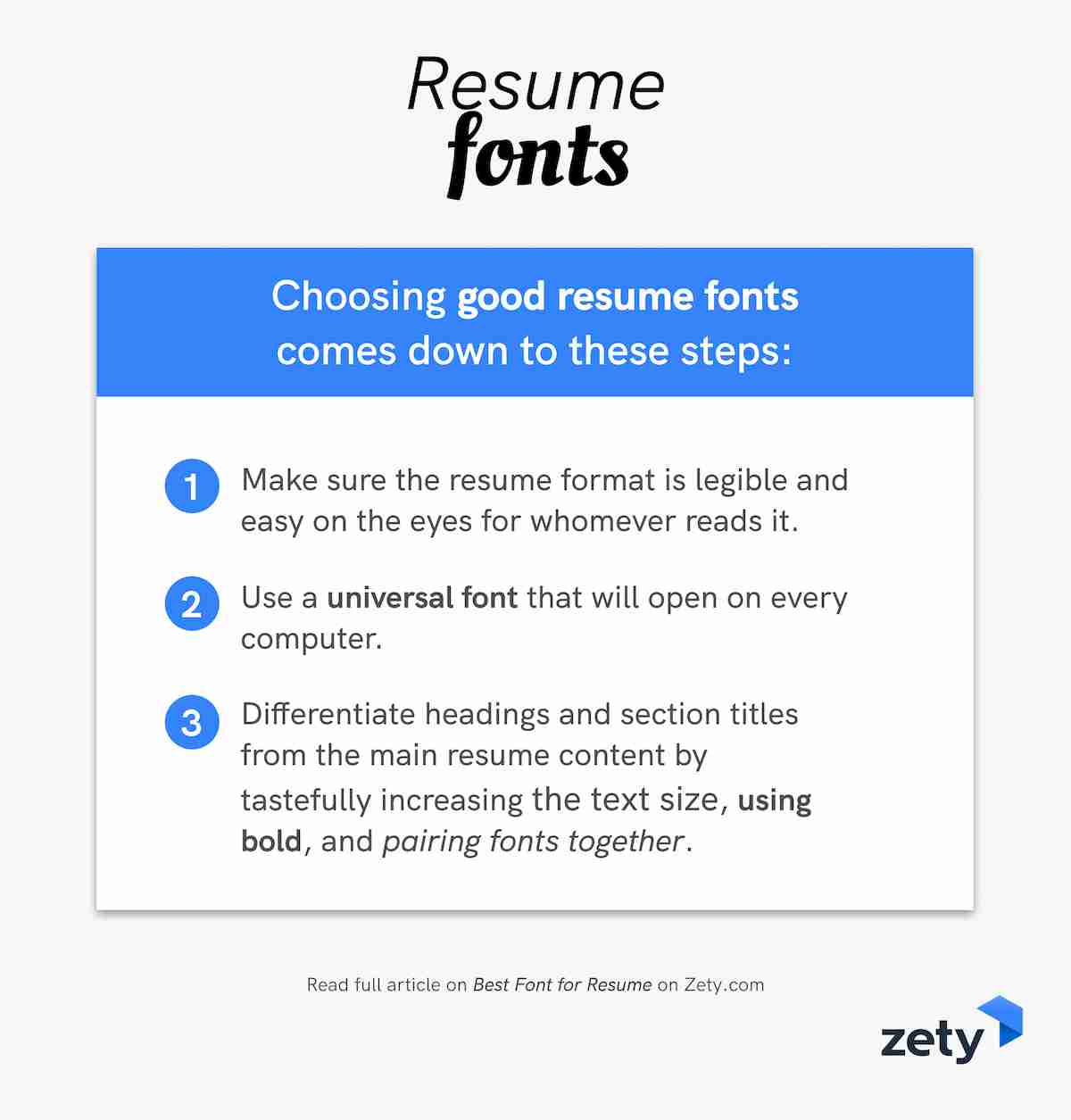
Choosing good resume fonts comes down to this:
- Make sure the resume format is legible and easy on the eyes for whomever reads it.
- Use a universal font that will open on every computer; you don’t want tofu!
- Differentiate headings and section titles from the main resume content by tastefully increasing the text size, using bold, and pairing fonts together.
Have any questions on how to choose the best resume font? Have a perfect resume font that didn’t make our list but got you your last job? Share it with us or just give us a shout in the comments below and we’ll answer your question. Thanks for reading!
Frequently Asked Questions about the Best Font for a Resume
What is the best font for a resume?
Consider sans-serif fonts like Arial, Verdana, and Helvetica, which are known for their clarity. You can also use the tried-and-true ones like Times New Roman or Georgia. The same rule applies when creating a CV and looking for the best CV fonts.
Best fonts for a resume have to meet the following criteria:
- Have good spacing and readability.
- Read well within the 10–12 pts size range for the resume body and 14–16 pts for the headings.
- Be ATS-friendly.
If you use a professional resume builder, you’ll be able to fill out your resume first and then play around with fonts and resume layouts to find the best fit—without having to start each time anew.
What is the best font size and format for a resume?
For proper resume formatting, go with 11–12 pts for the main body (10 if absolutely necessary) and 14–16 pts for resume headings. Make sure your font of choice reads well with the size. Times New Roman is a classic, but if you prefer a cleaner look, explore sans-serif fonts (like Verdana or Helvetica). Stay away from heavy and cursive fonts (no Comic Sans!). Also, feel free to use bold type, italics, and underlining to make your resume easier to read (and highlight the important bits).
When you have all the information filled out, you’ll see if you can afford to go down a font size or if you should consider a two-column resume structure. Don’t sacrifice readability to fit your document into one sheet, though. It’s a misconception that your resume should be one page always—if you’re an experienced candidate, two pages are fine.
What is the best font for the ATS?
There are only a couple of fonts that will help you get past the ATS. The best ones are Times New Roman and Arial. Besides, Arial will allow you to fit as much information on the page as possible (but always consider if a two-page resume would be a better choice).
Keep in mind that utilizing unconventional fonts to create an eye-catching resume may prevent it from being ATS-compliant. Instead, make proper use of headings and bold type to separate the sections and make the document look presentable.
What is the best font for a professional or executive resume?
Here are some professional resume fonts to pick from:
- Arial
- Helvetica
- Verdana
- Times New Roman
- Garamond
- Georgia
- Calibri
- Cambria
Creating a perfect resume for any industry starts with ensuring good readability, so make sure your resume is well-structured and has enough white space. The best resumes for business environments usually avoid overly creative resume templates and fonts, steering toward a more classic look.
Is Times New Roman outdated?
It’s conservative, but not at all outdated. In fact, if you’re applying for a job in a more traditional sphere, it may be just right. So, if you’re creating a resume in Word, and your first instinct is to choose Times New Roman, don’t fight it. It reads great, it’s familiar, and it looks professional. Make sure not to go below 10.5 pts, though, as it will affect readability.
If you’d like to create a more modern style resume, try space-efficient sans-serifs like Tahoma, Verdana, or Arial. Also, don’t forget about standard resume margins (one inch on all sides).